Create charts using plotly
learn how to create charts using plotly

Create charts using plotly
Overview
- Plotly is
- open source graphing library for python
- graphs generated by plotly are interactive
- you can use it with jupyter notebook or with web apps like streamlit
- In Active development with good documentation
- Documentation
- Plotly have ridiculous amount of features, it’s not feasible for me to cover all of them so I am going to focus on only those which I’ve used personally, I’ll add more variations and chart types in future
Setup
- use
Pip install plotlyto install plotly package - i am using streamlit to run this sample code but you can use jupyter notebook or just run locally just use
fig.show()instead ofst.plotly_chart(fig) - for data I’ve generated Concrete Test Data for M30 Grade Concrete
- sample code is given below to load this data using pandas,
Pip install pandasto install pandas package
1
2
3
4
5
6
7
8
9
10
11
12
13
14
15
16
17
18
import pandas as pd

# Concrete Compressive Strength Test Data for 10 samples of M30 Grade Concrete
# Each sample have 4 results for 7/14/21/28 days
data = []
data.append([22.1, 26.9, 28.5, 30.9])
data.append([21.8, 26.5, 28.2, 30.6])
data.append([22.5, 27.1, 28.8, 31.0])
data.append([21.6, 26.3, 28.0, 30.5])
data.append([22.3, 27.0, 28.6, 30.8])
data.append([21.9, 26.6, 28.3, 30.7])
data.append([22.0, 26.8, 28.4, 30.9])
data.append([21.7, 26.4, 28.1, 30.6])
data.append([22.2, 26.9, 28.7, 31.1])
data.append([21.5, 26.2, 27.9, 30.4])

# Create DataFrame
df = pd.DataFrame(data, columns=["7D", "14D", "21D", "28D"])
Predefine Charts
- Import plotly package using
import plotly.express as px - Method to display chart
- Streamlit
st.plotly_chart(fig) - Jupyter Notebook
fig.show()
- Streamlit
Column Chart Using series
1
2
3
4
x_data = ["a", "b", "c"]
y_data = [1, 3, 2]
fig = px.bar(x=x_data, y=y_data)
st.plotly_chart(fig)
- Add Title and Lables to your chart
- Here keep in mind that exept x and y data everything else is optional
1
2
3
4
5
6
7
fig = px.bar(
    x=x_data,
    y=y_data,
    title="Column Chart Using plotly",
    labels={"x": "Category", "y": "Values"},
    color=x_data
)
Column Chart using DataFrame
- To keep things simple let’s just plot 7D, 14D, 21D, 28D values for sample 1
- You can use
df.loc[0:0]to get 7D, 14D, 21D, 28D values for sample 1
1
2
3
4
5
6
7
# Create Column Chart for 7D, 14D, 21D, 28D but only for sample 1
# Here we are also transposing the data so we can keep 7D, 14D, 21D, 28D on seprates rows for plotly
plotData = df.loc[0:0].T
# Create plotly Column Chart
fig = px.bar(plotData)
# To plot this on streamlio
st.plotly_chart(fig)
- To get average value of 7D, 14D, 21D, 28D for all samples
1
plotData = df.mean().to_frame(name='Average')
- Modify your X and Y axis lables
1
2
3
4
fig = px.bar(
    data_frame=plotData,
    labels={"index": "Days","value": "Compressive Strength (MPa)", "variable": "Sample No"},
)
- Add Title
1
2
3
4
5
fig = px.bar(
    data_frame=plotData,
    labels={"index": "Days","value": "Compressive Strength (MPa)", "variable": "Sample No"},
    title="Concrete Test Results"
)
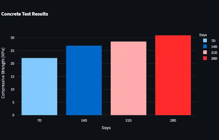
- Using different colors for each columns
1
2
3
4
5
6
fig = px.bar(
    data_frame=plotData,
    labels={"index": "Days", "value": "Compressive Strength (MPa)"},
    title="Concrete Test Results",
    color=plotData.index
)
Line Chart Using series
1
2
3
4
5
6
7
8
9
10
11
12
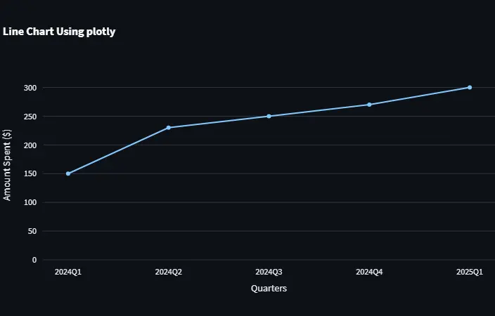
quaters = ["2024Q1", "2024Q2", "2024Q3", "2024Q4", "2025Q1"]
money_spent = [150, 230, 250, 270, 300]
fig = px.line(
x=quaters,
y=money_spent,
title="Column Chart Using plotly",
labels={"x": "Quarter", "y": "Amount Spent ($)"},
markers=True,
)
# Set Y axis range
fig.update_layout(yaxis_range=[0, max(money_spent) * 1.1])
Line Chart using DataFrame
- Line Chart code is similar to Column Chart code, just change in method name
px.bartopx.line
1
2
3
4
5
6
plotData = df.loc[0:0].T
fig = px.line(
    data_frame=plotData,
    labels={"index": "Days", "value": "Compressive Strength (MPa)"},
    title="Concrete Test Results",
)
- To plot All Sample Results
1
2
3
4
5
6
7
plotdata = df.T
fig = px.line(
    data_frame=plotdata,
    labels={"index": "Days", "value": "Compressive Strength (MPa)"},
    title="Concrete Test Results",
)
st.plotly_chart(fig)
Custom Charts
- graph_objects module is used to create custom charts
- Also this method work without pandas
- I’ve added sample code for most common chart tyeps
Line Chart
1
2
3
4
5
6
7
8
9
10
11
12
13
14
import plotly.graph_objects as go

# Data for M30 concrete strength
days = [7, 14, 21, 28]
strength_M30 = [22.1, 26.9, 28.5, 30.9]

# Create figure
fig = go.Figure()

# Add traces with custom names
fig.add_trace(go.Scatter(x=days, y=strength_M30,mode='lines', name='M30'))

# Display plot
fig.show()
Adding Multiple lines
1
2
3
4
5
6
7
8
9
10
11
# Data for M30 and M40 concrete strength
days = [7, 14, 21, 28]
strength_M30 = [22.1, 26.9, 28.5, 30.9]
strength_M40 = [25.2, 31.2, 35.2, 40.0]

# Create figure
fig = go.Figure()

# Add traces with custom names
fig.add_trace(go.Scatter(x=days, y=strength_M30, mode='lines', name='M30'))
fig.add_trace(go.Scatter(x=days, y=strength_M40, mode='lines', name='M40'))
Adding Labels
1
2
3
fig.update_layout(title="Compressive Strength Data",
                  xaxis_title="Days",
                  yaxis_title="Strength (MPa)")
Line formatting
1
2
3
4
fig.add_trace(go.Scatter(x=days, y=strength_M30,
              mode='lines+markers', name='M30'))
fig.add_trace(go.Scatter(x=days, y=strength_M40,
              mode='lines+markers', name='M40'))
Final Version
1
2
3
4
5
6
7
8
9
10
11
12
13
14
15
16
17
18
19
20
21
22
23
24
25
26
27
28
29
30
31
32
33
34
35
36
37
38
39
40
41
42
43
44
45
46
47
48
49
import plotly.graph_objects as go

# Sample data
days = [7, 14, 21, 28]
strength_M30 = [22.1, 26.9, 28.5, 30.9]
strength_M40 = [25.2, 31.2, 35.2, 40.0]
strength_M50 = [30.5, 36.8, 42.1, 48.9]

# Create figure
fig = go.Figure()

# Add traces with different colors and styles
fig.add_trace(go.Scatter(
    x=days,
    y=strength_M30,
    mode='lines+markers',
    name='M30',
    line=dict(color='firebrick', width=2)
))

fig.add_trace(go.Scatter(
    x=days,
    y=strength_M40,
    mode='lines+markers',
    name='M40',
    line=dict(color='royalblue', width=2, dash='dash')
))

fig.add_trace(go.Scatter(
    x=days,
    y=strength_M50,
    mode='lines+markers',
    name='M50',
    line=dict(color='forestgreen', width=2, dash='dot')
))

# Update layout
fig.update_layout(
    title="<b>Compressive Strength Data<b>",
    xaxis=dict(
        title="<b>Days<b>",
        tickmode='array',
        tickvals=[7, 14, 21, 28],
        ticktext=['7', '14', '21', '28']),
    yaxis_title="<b>Strength (MPa)<b>",
)

# Display plot
fig.show()
Conclusion
- Plotly is perfect to adding some visualization to your python App
- It’s ability to pan and zoom specific part of graph make it’s perfect for analysis
If you have any questions or want to discuss something : Join our comment section
This post is licensed under CC BY-NC-ND 4.0 by the author.