Add extra visuals to matplotlib charts
learn how to add shapes and annotations to matplotlib charts

Add extra visuals to matplotlib charts
Overview
- Adding visualization to existing charts can be great improvement to your chart
- By adding this visualization, you can
- highlight certain parts of the chart
- add custom text annotations or markers to make chart easier to understand
- create cross sections for your geometry
- I am assuming that you already know basics of matplotlib, if not go through this post first : Create charts using matplotlib
Setup
- use
Pip install matplotlibto install Matplotlib package - use
import matplotlib.pyplot as pltto import
Create Blank Chart
1
2
3
4
5
6
7
8
9
10
11
12
13
14
15
16
17
18
19
20
21
22
23
import matplotlib.pyplot as plt

# set plot size
plt.figure(figsize=(10, 10))

# Create blank plot
plt.axes()
ax = plt.gca()

# Set plot limits
ax.set_xlim([-100, 100])
ax.set_ylim([-100, 100])

# Add grid
ax.grid(linestyle='--')
ax.set_xticks(range(-100, 101, 100))
ax.set_yticks(range(-100, 101, 100))

# You can add code to add shapes or annotation here

# Display Plot
plt.tight_layout()
plt.show()
Add Circle
1
2
3
4
5
6
7
8
9
10
11
12
# Circle without fill
circle = plt.Circle(xy=(-50, -50), radius=25,
                    color="b", fill=False, linewidth=4)
ax.add_patch(circle)

# Circle with transparency
circle2 = plt.Circle(xy=(-50, -50), radius=15, color="k", alpha=0.2)
ax.add_patch(circle2)

# Circle with fill
circle3 = plt.Circle(xy=(-50, -50), radius=5, color="r")
ax.add_patch(circle3)
Add Rectangle
1
2
3
4
5
6
7
8
9
10
11
12
13
14
15
# Rectangle without fill
rectangle = plt.Rectangle(xy=(25, -75), width=50,
                          height=50, color="g", fill=False, linewidth=4)

ax.add_patch(rectangle)

# Rectangle with transparency
rectangle2 = plt.Rectangle(xy=(25, -75), width=30,
                           height=30, color="k", alpha=0.2)
ax.add_patch(rectangle2)

# Rectangle with fill
rectangle3 = plt.Rectangle(xy=(25, -75), width=10,
                           height=10, color="r")
ax.add_patch(rectangle3)
Add Line
1
2
3
line = plt.Line2D(xdata=[25, 75], ydata=[90, 90],
                  color="r", linewidth=4)
ax.add_line(line)
Add Polygon
1
2
3
4
# polygon without fill
polygon = plt.Polygon(xy=[(25, 25), (75, 25), (75, 75)],
                      color="b", fill=False, linewidth=4)
ax.add_patch(polygon)
Add Text
1
plt.text(-90, 90, "Circle", fontsize=14, color="r")
Add Dimension line
1
2
3
4
ax.annotate("", xy=(-90, 80), xytext=(-25, 80),
            arrowprops=dict(arrowstyle="->", color='black'))
ax.annotate("", xy=(-90, 75), xytext=(-25, 75),
            arrowprops=dict(arrowstyle="<->", color='black'))
Final Version
1
2
3
4
5
6
7
8
9
10
11
12
13
14
15
16
17
18
19
20
21
22
23
24
25
26
27
28
29
30
31
32
33
34
35
36
37
38
39
40
41
42
43
44
45
46
47
48
49
50
51
52
53
54
55
56
57
58
59
60
61
62
63
64
65
66
67
68
69
import matplotlib.pyplot as plt

# set plot size
plt.figure(figsize=(10, 10))

# Create blank plot
plt.axes()
ax = plt.gca()

# Set plot limits
ax.set_xlim([-100, 100])
ax.set_ylim([-100, 100])

# Add grid
ax.grid(linestyle='--')
ax.set_xticks(range(-100, 101, 100))
ax.set_yticks(range(-100, 101, 100))

# Circle without fill
circle = plt.Circle(xy=(-50, -50), radius=25,
                    color="b", fill=False, linewidth=4)
ax.add_patch(circle)

# Circle with transparency
circle2 = plt.Circle(xy=(-50, -50), radius=15, color="k", alpha=0.2)
ax.add_patch(circle2)

# Circle with fill
circle3 = plt.Circle(xy=(-50, -50), radius=5, color="r")
ax.add_patch(circle3)

# Rectangle without fill
rectangle = plt.Rectangle(xy=(25, -75), width=50,
                          height=50, color="g", fill=False, linewidth=4)

ax.add_patch(rectangle)

# Rectangle with transparency
rectangle2 = plt.Rectangle(xy=(25, -75), width=30,
                           height=30, color="k", alpha=0.2)
ax.add_patch(rectangle2)

# Rectangle with fill
rectangle3 = plt.Rectangle(xy=(25, -75), width=10,
                           height=10, color="r")
ax.add_patch(rectangle3)

# line
line = plt.Line2D(xdata=[25, 75], ydata=[90, 90],
                  color="r", linewidth=4)
ax.add_line(line)

# polygon without fill
polygon = plt.Polygon(xy=[(25, 25), (75, 25), (75, 75)],
                      color="b", fill=False, linewidth=4)
ax.add_patch(polygon)


# Annotations
plt.text(-90, 90, "Circle", fontsize=14, color="r")
# Dimension, Arrow
ax.annotate("", xy=(-90, 80), xytext=(-25, 80),
            arrowprops=dict(arrowstyle="->", color='black'))
ax.annotate("", xy=(-90, 75), xytext=(-25, 75),
            arrowprops=dict(arrowstyle="<->", color='black'))

# Display Plot
plt.tight_layout()
plt.show()
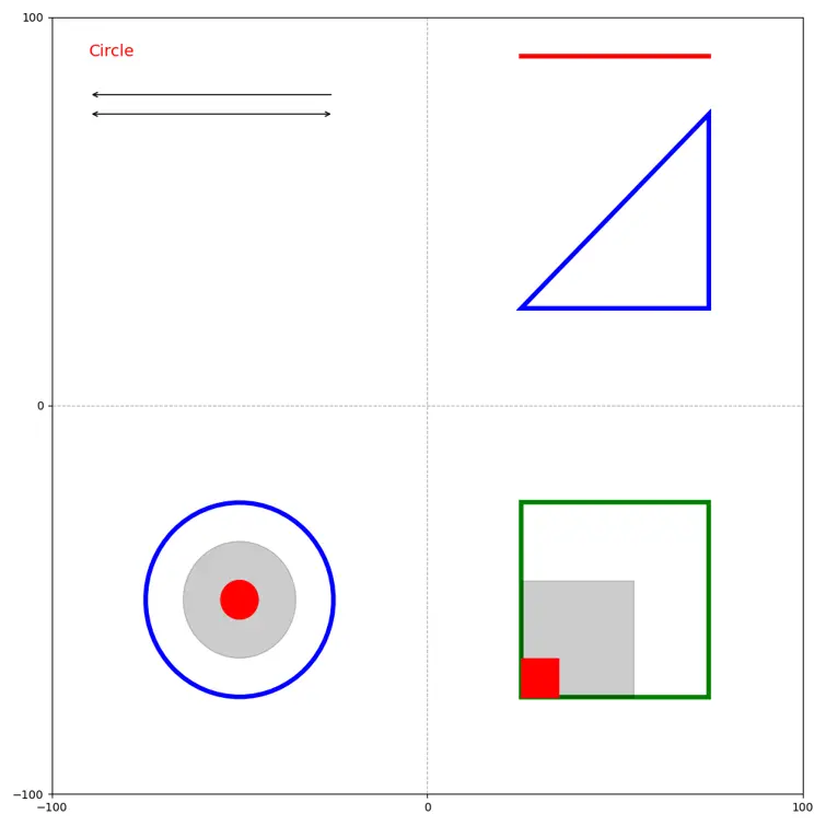 Screenshot 1 : Charts with shapes and annotations
Conclusion
- matplotlib cover almost everything when you need to add some custom visualization to your charts
Resources
- How to Add Shapes to a Figure in Matplotlib?
- How To Draw a Rectangle on a Plot in Matplotlib?
- Matlab Patches Reference
If you have any questions or want to discuss something : Join our comment section
This post is licensed under CC BY-NC-ND 4.0 by the author.