Create charts using matplotlib
learn how to create charts using matplotlib

Create charts using matplotlib
Overview
- Matplotlib is
- library for creating static, animated, and interactive visualizations in Python
- you can use it with Jupiter notebook or with web apps like Streamlit
- In Active development with good documentation
- Open source with good Documentation
- Requirements
- python 3.10 or later
- Matplotlib has a ridiculous number of features, it’s not feasible for me to cover all of them so I am going to focus on only those which I’ve used personally, I’ll add more variations and chart types in future
Setup
- use
Pip install matplotlibto install Matplotlib package - use
import matplotlib.pyplot as pltto import
Line Chart
- for sample data I am using Concrete Test Data for M30 Grade Concrete for 7/14/21/28 days
1
2
3
4
5
6
7
8
9
10
11
import matplotlib.pyplot as plt

# Data for M30 concrete strength
days = [7, 14, 21, 28]
strength_M30 = [22.1, 26.9, 28.5, 30.9]

# Create new plot using matplotlib
plt.plot(days, strength_M30)

# Display Plot
plt.show()
- So that’s bare minimum code for you to generate a line chart using matplotlib
- Now let’s try to add more visuals to our chart by going through few variations
- Also, I am only going to show modified part of code for rest of variation, so you have to add import statement ,data by yourself
Adding multiple lines
1
2
3
4
5
6
7
8
# Data for M30 concrete strength
days = [7, 14, 21, 28]
strength_M30 = [22.1, 26.9, 28.5, 30.9]
strength_M40 = [25.2, 31.2, 35.2, 40.0]

# Create new plot using matplotlib
plt.plot(days, strength_M30)
plt.plot(days, strength_M40)
Adding Labels
1
2
3
4
5
6
7
8
9
10
# Create new plot using matplotlib
plt.plot(days, strength_M30)
plt.plot(days, strength_M40)

# Add Title
plt.title("Compressive Strength Data")
plt.xlabel("Days")
plt.ylabel("Strength (MPa)")
# Only display specific days on X axis
plt.xticks(days)
- You can also pass font size and font weight
1
2
3
plt.title("Compressive Strength Data", fontweight="bold", fontsize=20)
plt.xlabel("Days", fontweight="bold")
plt.ylabel("Strength (MPa)" ,fontweight="bold")
Adding Legends
- Manually enter legend names in sequence of your plot lines
1
plt.legend(["M30", "M40"])
- You can also mention legend with plot itself
1
2
3
4
plt.plot(days, strength_M30, label="M30")
plt.plot(days, strength_M40, label="M40")

plt.legend()
Line formatting
- A format string
[marker][line][color]consists of a part for color, marker and line - Format Strings Docs
- Adding Color
1
2
3
4
5
6
# green line
plt.plot(days, strength_M30, color="g" , label="M30")
# red line
plt.plot(days, strength_M40, color="r" , label="M40")
# using hex value for red color
plt.plot(days, strength_M40, color="#FF0000", label="M40")
- Adding Line Style
1
2
3
4
# dashed line
plt.plot(days, strength_M30 , linestyle="--", label="M30")
# dotted line
plt.plot(days, strength_M40, linestyle=":", label="M40")
- Adding Line Width
1
2
plt.plot(days, strength_M30, linewidth=2, label="M30")
plt.plot(days, strength_M40, linewidth=4, label="M40")
- Adding marker
1
2
3
4
# triangle marker
plt.plot(days, strength_M30, marker="^", label="M30")
# circle marker
plt.plot(days, strength_M40, marker="o", label="M40")
Plot style
- you need to add this at start of your plot code
- you can find list of available styles from Style sheets
1
plt.style.use("fivethirtyeight")
Final Version
1
2
3
4
5
6
7
8
9
10
11
12
13
14
15
16
17
18
19
20
21
22
23
24
25
26
27
import matplotlib.pyplot as plt

# Data for M30 concrete strength
days = [7, 14, 21, 28]
strength_M30 = [22.1, 26.9, 28.5, 30.9]
strength_M40 = [25.2, 31.2, 35.2, 40.0]

plt.style.use("fivethirtyeight")

# Create new plot using matplotlib
plt.plot(days, strength_M30, color="k",
         linestyle="--", linewidth=1, marker="^", label="M30")
plt.plot(days, strength_M40,  color="r",
         linestyle="--", linewidth=1, marker="o",  label="M40")

# Annotations
plt.title("Compressive Strength Data")
plt.xlabel("Days")
plt.ylabel("Strength (MPa)")
plt.xticks(days)
plt.legend()
plt.grid(True)

# Display Plot
plt.tight_layout()
plt.show()
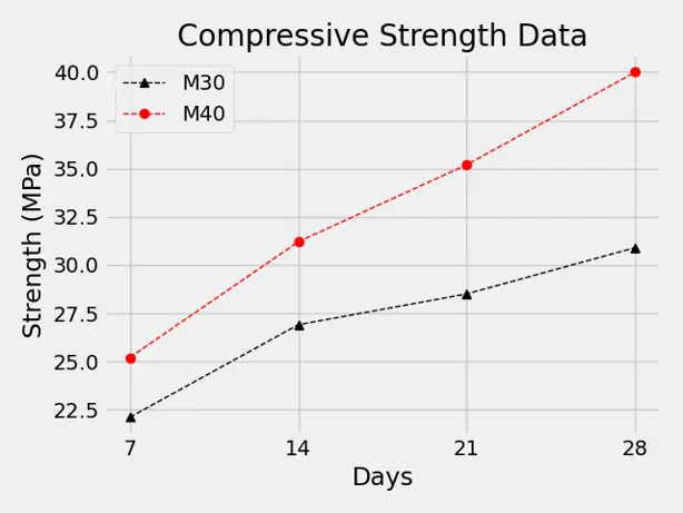 Screenshot 1 : Line Chart
Bar Chart
1
2
3
4
5
6
7
8
9
10
11
12
13
14
15
16
17
import matplotlib.pyplot as plt

# Data for M30 concrete strength
days = [7, 14, 21, 28]
strength_M30 = [22.1, 26.9, 28.5, 30.9]

# Create new plot using matplotlib
plt.bar(days, strength_M30, label="M30")

# Annotations
plt.title("Compressive Strength Data")
plt.xlabel("Days")
plt.ylabel("Strength (MPa)")
plt.legend()

# Display Plot
plt.show()
Adding lineChart to bar chart
- this code will add line chart on top of bar chart
1
2
plt.bar(days, strength_M30, label="M30")
plt.plot(days, strength_M40, label="M40")
Stacked Bar
- for stacked bar chart make sure plot with larger value is plotted first
- If you don’t do this bars with higher value will completely cover bars with lower value
1
2
3
# Plotting M40 bar first due to it's higher value
plt.bar(days, strength_M40, label="M40")
plt.bar(days, strength_M30, label="M30")
Adding multiple Bars
- For multiple bars side by side to avoid overlapping we need to adjust days values by adding offsets
- For this we are going to use numpy
- import numpy using
import numpy as np - In below sample code we have added 0.8 as offset to Days value to display bars side by side
- 0.8 is default width of bar in matplotlib, you can adjust that offset value as per your requirement
1
2
3
4
5
6
7
8
days = [7, 14, 21, 28]
days_index = np.array(days)
strength_M30 = [22.1, 26.9, 28.5, 30.9]
strength_M40 = [25.2, 31.2, 35.2, 40.0]

# Create new plot using matplotlib
plt.bar(days_index, strength_M30, label="M30")
plt.bar(days_index+0.8, strength_M40, label="M40")
- one more thing you can do is adjust both bars with offset to keep it symmetrical
1
2
3
4
bar_width = 0.8
# Create new plot using matplotlib
plt.bar(days_index-bar_width/2, strength_M30, label="M30")
plt.bar(days_index+bar_width/2, strength_M40, label="M40")
Final Version
1
2
3
4
5
6
7
8
9
10
11
12
13
14
15
16
17
18
19
20
21
22
23
24
25
26
27
import matplotlib.pyplot as plt
import numpy as np

# Data for M30 concrete strength
days = [7, 14, 21, 28]
days_index = np.array(days)
strength_M30 = [22.1, 26.9, 28.5, 30.9]
strength_M40 = [25.2, 31.2, 35.2, 40.0]
bar_width = 0.8

plt.style.use("fivethirtyeight")

# Create new plot using matplotlib
plt.bar(days_index-bar_width/2, strength_M30, label="M30")
plt.bar(days_index+bar_width/2, strength_M40, label="M40")

# Annotations
plt.title("Compressive Strength Data")
plt.xlabel("Days")
plt.ylabel("Strength (MPa)")
plt.xticks(days)
plt.legend()
plt.grid(True)

# Display Plot
plt.tight_layout()
plt.show()
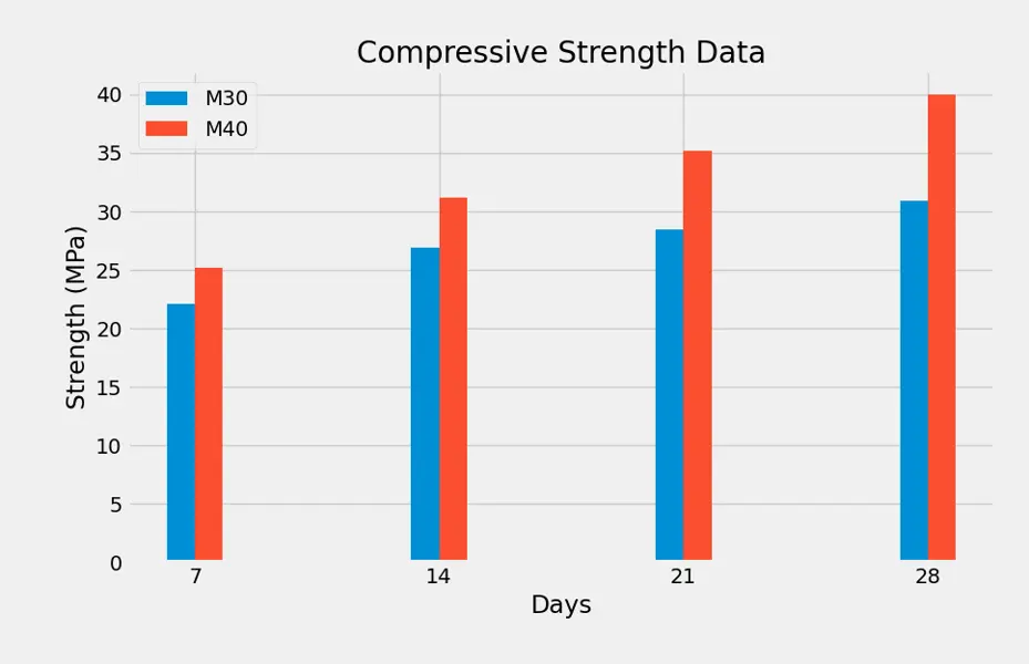 Screenshot 2 : Bar Chart
Conclusion
- matplotlib is perfect way to add some visualization to your python App
- It’s compatible with almost everything be it local app or web app(Streamlit) or Interactive notebook(Jupyter notebook)
Resources
- Matplotlib Tutorials by Corey Schafer
- Bar Graph using python tutorial
- Charts using Subplot and jupyter notebook
If you have any questions or want to discuss something : Join our comment section
This post is licensed under CC BY-NC-ND 4.0 by the author.